
NORDIC NATURALS
A high-end supplement brand that prides themselves on quality, integrity, and transparency in everything they do. While they’ve perfected their product, their packaging doesn’t stand out on the shelf. Their main line of omegas is what they want to focus on rebranding first, then designing a campaign to release a new omega made for pets.
REBRAND DIRECTION
Nordic’s packaging is similar to its competition, which is outdated and generic. Because of this, moving the brand towards a more modern design will make it pop. At the same time the package needs to be high-end, trust-worthy, and timeless to stay true to the brand values.


SKETCHES
There were two modern styles I stuck with when playing with layouts for the front of the box. The first was bubbly and friendly, really leaning into a youthful energy. The other is more mature, clean, and structured.


DRAFTS
The mature direction fit best with the brand’s personality and was the more timeless option to move forward with. I digitized three different layouts focusing on keeping them legible and simple.
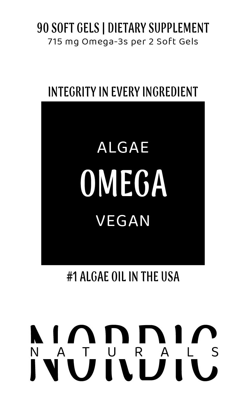


FINAL PACKAGING
The final packaging is a mix of the three drafts, making it both balanced and asymmetrical. The supplement variation is the focal point because while branding is important, people are just looking for what they need when buying supplements. The packaging is memorable enough to ensure people will be able to find it again without knowing the brand name.


