PAUL RAND
A well known and respected graphic designer known for bringing modern design to corporate America. Rand infamously used simple shapes and concepts to convey an instant message and interest to his audience. His true test of a good design was to see if his young daughter understood what it was trying to say.
BOOKLET DIRECTION
These mood boards show Rand’s work in different media. I took inspiration from all of them noticing patterns of bold colors, mixed typefaces, and basic shapes. I’ll combine all of these elements to create an on-brand booklet honoring Rand and his work.


SKETCHES
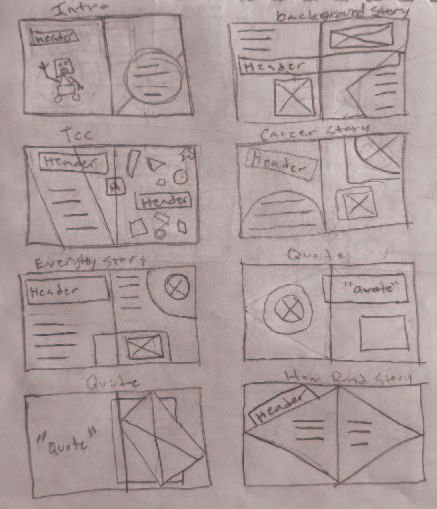
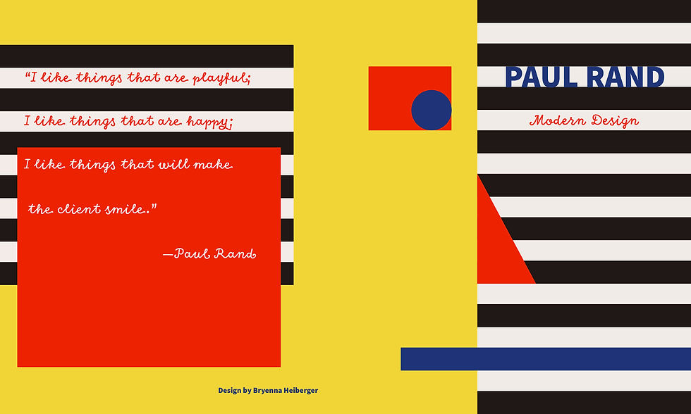
For the cover sketches I took my main inspiration from Rand’s book covers. Exploring different ways to portray his design style, personal look, and name in a way that he would appreciate. I used elements from those sketches to create interesting layouts for the interior of the booklet.


DRAFTS
I focused on further developing the graphic heavy designs where typography is secondary. This hierarchy style resembles Rand’s work best and catches the eye, enticing people to engage with the design.


FINAL BOOKLET
I continued the style of the logo to create a brand book for Mood Ring. Informing the client in a digestible way how and when to use the logo. It also includes company fonts and colors ensuring brand consistency.


