MAISON MIEL
A simple syrup made for young nostalgic adults who appreciate high-end cocktails. Made better by using honey instead of the typical sugar that other brands use to make simple syrup. The packaging design will be a summer line of organic infused simple syrups with sophisticated flavors.
PACKAGING DIRECTION
Out of these three mood boards I decided to move in the modern direction with a little influence from the edgy board. I wanted to keep it simple and high class, focusing on making it stand out from the competition.


SKETCHES
While I knew what direction I wanted to go in I explored the other themes to ensure I was going in the right direction. The bottom images are refined versions that I decided to continue with.


DRAFTS
I digitized one concept for each theme and ended up going in the initial direction I thought I would, which was simple and modern.


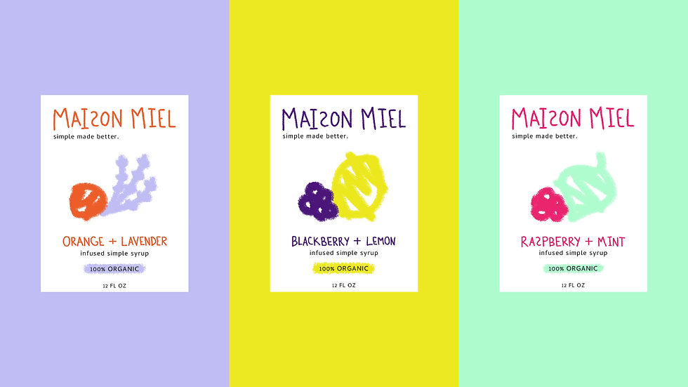
FINAL PACKAGING
The final design plays with the concept of childhood nostalgia, bringing back the memories of mixing potions and making sweet drinks. This is represented by the label being a blank piece of paper that’s been drawn on with crayons.